Design Critique
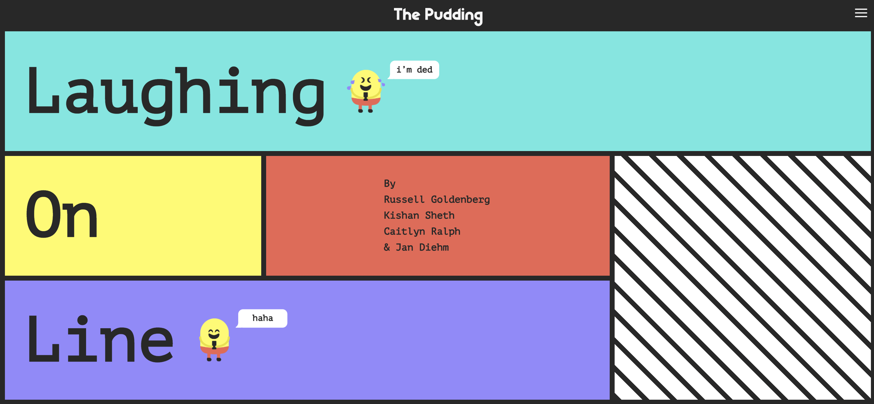
Chosen Visualization : Laughing OnLine, by Pudding
Laughter is complex and in real life it can be harder to decode it online. This visualization is a series that takes a closer look at the usage, evolution, and perception of the digital laugh published on Pudding done by Russel Goldenberg, Kishan Sheth, Caitlyn Ralphand Jan Diem
Analysis from a Creator Perspective
1. Pragmatic
(Context and Effectiveness)
Purpose and Objective
The purpose of the visualisation is to look at the grammar and visual cues that express laughter in the evolving online world. The visualisation could help get a clearer picture to distinguish fake from real laughter as expressed through words. Audience
This visualisation could be made for gen-z, the people of the internet.
Style of Visualisation
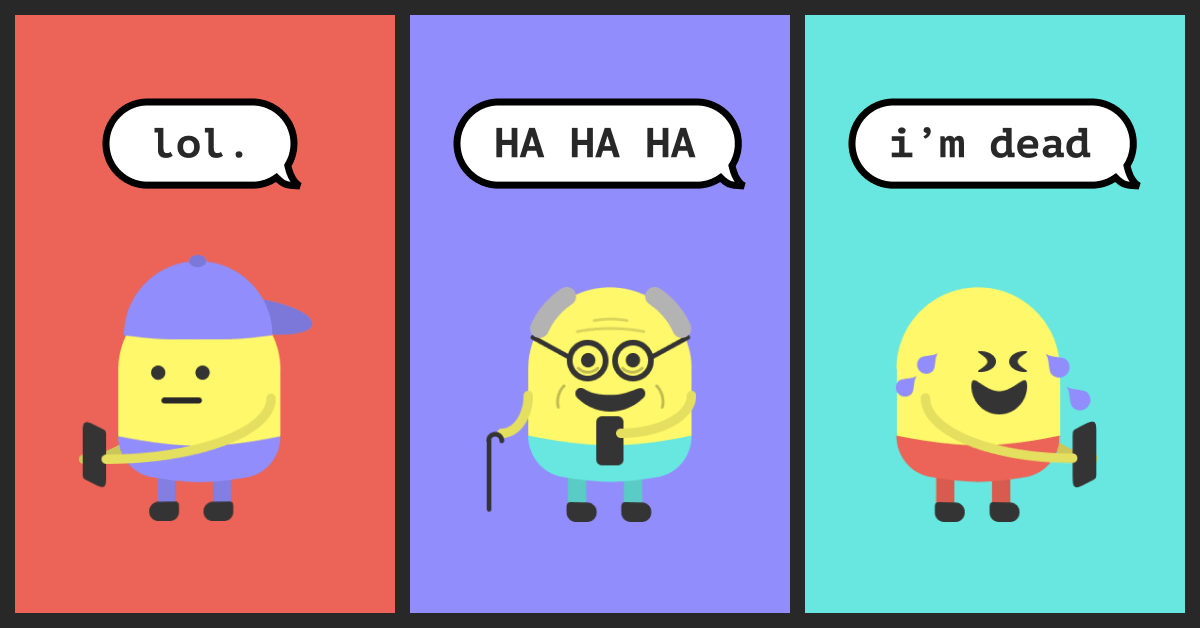
It is an exploratory narrative that measures the funny index of a laugh, the evolution of lol and how the internet has evolved in terms of usage of laughter words.
2. Semantic
(Meaning and Truth)
What Does this Data Mean - The Visualization
The visualization answers 3 main question on laughter lingo. It starts with engaging the audience to put in their votes on picking a laughter word and rating it according to how funny they find it. This allows the audience to be actively engaged in the visualisation. It next talks about how the laughter word 'lol' evolved using a simple line chart and comparing it to other used laughter words. The insights from the chart have been written below the chart which also include some additional context, facts and data. Next they visualise the number of times a laugh expression has been shared on the internet by using a tree map and interactive hover. They also mention that the words 'lool' and 'lol' were counted under the same data column. The next chart gives an insight on the way the words are typed - lowercase vs uppercase usage in text.
Questions the visualisation is it trying to answer
- How funny is laughter lingo?
- How people perceive laughter lingo?
- When did laughter lingo come into our vocabulary?
- How did the usage of laughter lingo evolve over the years?
- What other lingo represents laughter?
- What acronym do people use while laughing?
- Does changing the case of the lingo affect the degre of funnyness?
3. Syntax
Interaction and Narrative Design
The primary interaction is a long page scroll. The visualisation starts with talking about the structure first - the topics the article covers, which gives a clear picture of narrative. The first interactive slider is great to get the audience engaged and interested in the data and make them feel like they are a part of the dataset.
Raw Data -
Text
Input Data -
Laugh Lingo, Time, Percentage, Votes,
Data Transform -
Funniness of laughter lingo, capitalisation of laughter lingo, number of shares,
View 1 -
Mark : Rule
Layout : Cartesian
Encoding : Position X : Degree of funniness
View 2 -

Mark : Area Chart
Layout : Cartesian
Encoding : Position X : Time
Position Y : Number of Votes X Axis label only
View 3 -

Mark : Line chart
Layout : Cartesian
Encoding : Position X : Year
Position Y : Percentage of laughs X and Y Axis label only
View 4 -

Mark : TreeMap
View 5 -

Mark : Horizontal Stacked Bar Chart with an Independent Variable on Y
Layout : Cartesian
Encoding :
Position X : Lowercase, Uppercase,
Position Y : Number of Shares
Aesthetic and Quality of Design
The use of fun colours, emojis and interactive elements at each chart makes the narrative interesting and keeps the user engaged. The facts are well represented and straightforward with filters that allow you to view the data- the way you want to.
Analysis from a User / Audience Perspective
1. Pragmatic
(Context and Effectiveness)
The visualisation is fun, effective and simple. The use of emojis and bright colours conveys the overall mood and language of the visualisation. The charts and graphs are modified to match the theme of the narrative and are fun and interactive. The visualisation allows just enough exploration for the user to read the data.
2. Semantic
Takeaway from the Narrative
It was insightful to look at the way laughter is perceived by different people and the way it is expressed. The way they portray the rise of the laughter lingo is more like an evolution and got me thinking if it's fair to compare laughter to real life.
3. Syntax
At a Glance, a Low Level Perception -
Any person who spends time on the internet would not be surprised by the representation of the lingo. While the representation has been done well, capitalisation of words and length of the words might affect the way the 'funniness' is perceived.